Showing posts with label Color and Paint. Show all posts

Wednesday, August 17, 2011

{Design Seeds} color palette search


We know it's been a while since we last posted. Busy Busy! But we're still just as design and decorating obsessed as ever!

Check out {Design Seeds} color palette search section of their website here. It's an amazing collection of palettes inspired by photographs. I have it bookmarked because as a graphic designer, I'm always looking for color inspiration for things that I design.

I also think this is an amazing bookmark to refer to if you are decorating or redecorating your home.

Enjoy!

Sunday, December 5, 2010

Design Tip of the Week (12.6.10): Red means STOP

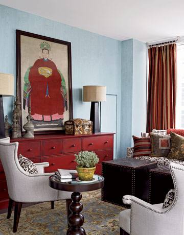
Stop to stare! Red is red hot this season in the home. Here are some ideas of how to use red as your dominant hue and how to just add a splash!

Inspiration to take the full plunge...


{Images from Country Living}


{Image from Home Interior Design Themes}

Or just stick a toe in...


{Images from Live Your Style}


{Image from Twolia}

Monday, October 25, 2010

Design Tip of the Week (10.25.10): Orange you glad you picked orange?

ORANGE. It brings to the mind fall and pumpkins, perfect for an October topic. While a comforting color, it can be tricky to use, especially as a predominant hue in a room. How do you do that tastefully you ask? Here are some tips when using orange and inspiration to get you started.

Some tips when decorating with orange...
*Use shade variations of orange in one room

*Start with an accent wall, tie a matching or complimentary shade of orange in the curtain fabric, upholstery, or accent pieces.

*Good complementary colors to add to your orange room are teal, purple, brown, and pinks (as shown below - orange and fuchsia are a very striking combination!)

{Photo from BHG}


If your just not ready to paint with orange, accent with it!

{Image from BHG}


But if your ready to take the plunge, here are some ways to dive in.

{Photo from Apartment Therapy}


{Photo from Southernliving}


{Photo from Martha Stewart}


{Photo from Growers and Nomads}


For more great orange ideas see BHG's decorating with orange slideshow

Sunday, September 12, 2010

Design Tip of the Week (9.13.10): Easy Makeovers

A fresh coat of paint can change a room dramatically. Its amazing what a difference a new color will do to a space without changing any other element. Furniture and complementary colors will take a new form. Its a fast and easy way to completely redo a room's look and costs nothing more than a gallon or two of

Check out last spring's Primed4Design{er}changed the look of two rooms with a simple change of wall color.

Laura took her guest bedroom from a yellow hue to a warm brown.
Before:


After:


To rework the living room, the ragged paint effect was replaced with a fresh blue to bring a new feel and style to the room.

Before:


After:


Throughout the Fall, P4D will share some tips on easy ways to makeover a room. You too can be a weekend warrior.

Sunday, August 22, 2010

Design Tip of the Week (8.22.10): Let the Sun Shine

I'm currently experimenting with yellow and found that this is not the easiest color to work into a room. My design dilemma was using yellow tastefully and stylishly without over doing it or making the room too feminine. And most importantly, using yellow in a way that I could live with day in and day out. I sought out some inspiration on the many ways you can use yellow in a room. From bold to subtle, from a primary to an accent color...yellow truly does brighten up a room. How bold can you be with this sunny hue?


{Image from Warpedeco Home Improvement}


{Image from Patricia Grey}


{Image from Apartment Therapy}


{Image from BlissLiving Home}


{Image from QwickStep}


{Image from Country Living}


{Image from Qwick Step}

Monday, July 19, 2010

Design Tip of the Week (7.18.10): Revisiting Colors


Good morning everyone~hope you all had a great weekend! We have over 2 years worth of Design Tip of the Week postings, so we thought for today we would revisit this posting about the psychology of color ~ Enjoy!

Monday, July 5, 2010

Design Tip of the Week (7.5.10): Tasteful Red, White & Blue Interiors


Hope you all had a great holiday weekend! In honor of the 4th of July and the patriotic colors of Red, White, & Blue ~ check out this inspiring slideshow from House Beautiful Magazine. Enjoy!

Monday, October 12, 2009

Design Tip of the Week Rewind! (From 8.11.08): How to Decorate a Small Space

Bringing one out from the archives for ya! Lots of good tips for those of you with some space limitations.

Small rooms always seem daunting to us as we struggle to find ways to use them efficiently and maximize their potential. We all have had to face this challenge, whether its our small city apartment, a small nook in the house that is dying for some love, or that glorified walk in closet the realtor called a "third bedroom". Color, placement, and design can all work together to create the optical illusion of a comfortable and airy space. Here are some simple tips to help make any small space open up:


*Paint the room all one color, including the ceiling, which will eliminate the visual separation that occurs when the ceiling is a contrasting color. Use cooler color hues like a light blue or a mint green to create a feeling of openness and calm.

*Expand a rooms size by using furnishings that increase amount of "negative space" rather than opting for bulk pieces. Negative space is a design term that describes the areas of emptiness surrounding the objects in your room. For example, a couch on legs versus one that has a fabric skirt at the bottom creates more negative space because you can see under the couch from all angles. Another example is using a glass side table with a simple base or a chair with an open back and visible legs.


*Use mirrors! See our August 4th for tips and examples of how to use mirrors to create more open space and depth in your home.


*Declutter the room and try to find multi-functional pieces that you can store your unsightly stuff. Need an ottoman? Than choose one that has storage space in it.

*Reduce the use of patterns. Stay simple by getting furniture with solid color fabrics and incorporating some simple patterns for accents (like throw pillows).


*Stay away from heavy drapes. Instead of choosing those rich floor length curtains, use shutters or blinds. They take up less room, increase negative space when open, and the horizontal lines of shutters actually widen the space.

Lets face it, sometimes the illusion is way better than the reality. :)
___________________________________________________________

Friday, August 14, 2009

Easy Fix Friday ~ Color Makeover

TODAY WE ARE STARTING A NEW FEATURE CALLED EASY FIX FRIDAY (3RD FRIDAY OF EVERY MONTH)! :) WE WILL FEATURE A READERS DECORATING DILEMMA AND THE EASY FIX FROM US! Please email primed4design@gmail.com if you have a small decorating dilemma you need help with, and you may be featured here on the blog.

Suzanne from New Jersey contacted P4D to get advice on what color to paint her living room. Currently, she has a very monotone color scheme consisting of very light beige (almost white) couches and wall color. The only punch of color is the wine and beige colored rug. She is looking for a wall color that will brighten up the room and make the furniture more visible.

All 3 of the wall colors (Sherwin Williams) to chose from will make the couches pop, but staying within a nice warm color scheme. We suggest accenting with dark chocolate browns and dark reds (similar to that in the rug). A dark wood coffee table and chocolate colored throw pillows would add a nice contrast to the light couch and make the color of the walls pop a little more. Our "easy fix" color palette recommendation:


Some accents that would complement this color palette:


1. Target's Metro Coffee Table

2.Land's End Combed Cotton Cable Knit Throw in mahagony

3. West Elm's Bronze Ceramic Table Lamp

For furniture placement, if space permits, we would angle the chase lounge and place a small chocolate wood table between it and the couch. If not, you may want to push the two couches together (but keeping that window open would be a nice option). Add a nice lamp and you got yourself a warm and cozy living space. Good luck!

Wednesday, August 12, 2009

DIY Tips & Tricks ~ Putting Your Art to Work

Kati, a reader in California, recently wrote to P4D to share a DIY project with us:

"After the Bar Exam, I had all these posters that I had used to make study aids. Not wanting the walls of my apartment to be decorated with posters such as "Elements of Defamation" or "California Property Division at Divorce" for one single second after I took the exam, I decided to paint over them using ideas and tips from your website."

Kati referred to our DIY Make your own Art posting where we had a slideshow available from BH&G.

Here's what Kati created from her recycled study boards...

"One of the suggestions was to take paint and dip it in cups and make circles, which is what I did on this poster board."


"This poster I just dripped paint down the sides at different angles. Super easy and total cost is about $3."


"I continued with the dark pink theme in my bedroom, and made the "Pollock-esque" painting to hang over my TV."


"I took another Bar Exam poster and tried to make a Rothko-esque painting to match the greens and blues in my living room."


Some fun tips Kati shared:
*She bought "mess-up paint" from Home Depot for $5 a can to keep her paint costs down. It is the paint where the color was slightly off for the buyer, and cheap for you to buy for projects!
*The paint made the poster board bend slightly so Kati used small gold hooks that you screw into the wall to keep the edges down and hang it. You can see them in the first circle picture.

Monday, June 22, 2009

Design Tip of the Week (06.22.09): Its all in the finish


Picking the color of your paint is only half the battle (albeit the more difficult half). Now you have to pick the finish! Here are some general tips on picking the right finish for your desired look and function. There are 6 predominant finishes available.

Matte finish (aka FLAT finish) is generally used on interior walls. Flat finish doesn't reflect light so its recommended for walls where you need to hide imperfections like bumps or cracks. Scratches happen on flat paint, so keep extra for touch ups. Don't use this paint in high traffic areas, it won't endure the wear and tear. Ceilings and low use walls are generally painted with a flat finish.

Flat enamel has a matte finish but is more more durable than flat and can endure an occasional cleaning. Hallways are a good room for this paint. Also powder rooms (where water and steam are not an issue) are a good room for this paint. Think matte, kicked up a notch.

Eggshell finish has a low sheen like the shell of an egg. It has a slight hint of shine and is durable, so this is also a good choice that can be used across your house. Its an attractive paint and dirt can be wiped off.

Satin finish is similar to eggshell, but has more sheen and can endure some scrubbing. This is a great paint to use in any room and can endure some wear and tear. It also can be contrasted against matte finish for trims, doors, windows, or ceilings if you are looking for less of a sheen than semi gloss to accentuate elements in the room.

Semi-Gloss has a high sheen without being too glossy. It is very durable and easy to clean. It is a nice contrast against matte, satin, or eggshell finishes. However, you must prep your surface before using this paint since it will show imperfection. This is also a great accenting paint to show off all your nice molding.

Gloss paints have a reflective quality and can even look similar to plastic with its high sheen. Its not a paint you use in large doses. Use it sparingly in a room. It is critial to prep and sand your surface (if necessary)because it is an unforgiving paint and will show all imperfections.

Common applications for these popular paint finishes:

*Satin or eggshell finishes - Use in rooms that get some traffic, guest bathrooms, bedrooms, kids rooms, etc.

*Semi gloss - Apply to trim, doors, windows, banisters, molding, knobs, and cabinets. Also this paint finish is a good choice for high moisture areas and areas that need to be scrubbed like kitchens and bathrooms. But make sure to get a mildew resistant paint for those areas.

*Glossy finish - Good for painting furniture and for accenting.

TIP! Different finishes vary from one brand to the next. Evaluate this as well as the color when making your choice (getting samples and applying it to the wall are the best options) to ensure you get the look you want.

AND NOTE TO SELF...bright colors fade faster so touchups become more difficult. Choose your color and your finish based on this knowledge.

Now that you are totally overwhelmed...go paint your house!

Wednesday, April 15, 2009

DIY Tips & Tricks~Rag, Crackle, Pop! :)

Today we want to school you on the wonderful world of painting techniques. There are so many ideas and ways to paint out there. Today we wanted to focus on the Ragging and Crackle techniques of painting.

Ragging is an easy way to add a subtle level of depth to your walls. The great thing about ragging is that you can do it with your pre-existing wall paint if you chose to. Ragging-on is where you apply another layer of paint/gloss over the original so you are adding a layer. Ragging-off is lifting off the top glaze to reveal the coat underneath. Experiment with rags, newspapers or plastic bags to see which creates the look you like best.

HGTV has a simple explanation of how to apply this technique. Click Here and start your new project!

Laura, April's designer of the month, used ragging in many of her main rooms to add a slightly dramatic affect to the browns and golds she selected for the walls.


Crackle is a very popular way of painting furniture (and sometimes walls) to achieve that "worn look" in 2 days if you don't have 100 years to wait for that look. :)

This page from Valspar lets you know of all the tools and materials you will need. If you scroll down to the bottom of the page they also give you some great paint combos for the crack finish to really pop.


If you remember Brad's LA home from our "March Decorator of the Month" post here - he did a fabulous crackle paint job on his fireplace. It gives his contemporary home a little slice of the antique wood vibe. It's always great to mix it up a bit in your home!