Friday, January 29, 2010
Friday Finds ~ Le Grain Sack Rug
{image via VivaTerra}
Who knew a grain sack could look so nice?! This Vintage Grain Sack Rug is perfect for a french country kitchen.
Thursday, January 28, 2010
Art Smart ~ Pretty Little Ring Holder
{photo via DarriellesClayArt etsy shop}
The perfect gift for yourself, your sister, your mom or your friend! Just in time for love day ~ this sweet little ring holder from DarriellesClayArt that will be a great addition to your bedroom dresser.
Wednesday, January 27, 2010
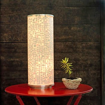
DIY Tips & Tricks ~ Customize Your Lamp
{photo via ReadyMade}
Seriously, who else has a pile of buttons that are waiting to be used? I know I do! This is just the right project to finally get rid of them! haha Head on over to ReadyMade for super easy instructions on how to give an Ikea lamp some fun texture.
Tuesday, January 26, 2010
Dandy Chandy Tuesday ~ Shower in Style
You know we are obsessed with chandeliers or anything that features one on it! The style, the grace, the glam of a chandelier...and the thrill of finding great priced chandy's for your home really keep us going! :)
Freaking love this DwellStudio® for Target® Chandelier Shower Curtain.
Hellooooo, can we say our favorite colors grey and purple together looks so lovely?! Complete your bathroom look with this beautiful purple towel set.
Or if you want to glam up your bedroom with the same designs, check out this DwellStudio® for Target® Chandelier Bedding Collection. So beautiful!
We don't suggest doing your bathroom and bedroom, one or the other. You don't want people thinking your obsessed or something! ;)
Monday, January 25, 2010
Feng Shui & the Kitchen Stove
{Photo via This Old House}
One of the most important considerations in feng shui is the location and placement of the main entrance, bedroom and stove. Today we will focus on the stove.
In feng shui, the stove is important because it governs the health of not only the cook, but all occupants of the home. The stove is used to prepare our meals, and when we consume our meals our body uses the energy from the food to sustain our lives. It is for this reason that we want the stove to be facing one of our best directions.
{photo via Moon-Goddess~Earth's flickr stream}
Depending on your date of birth and gender, each person has four different auspicious or positive and four malevolent or negative directions. Having the stove facing our positive direction will infuse the prepared food with energy that is favorable and supportive of good health. To find out what your favorable directions are please click here and enter your birthdate into the 8 Mansions Feng Shui Calculator.
So how do you find out what direction your stove is facing? Using a good compass, stand with your back in front of the stove (as if you were inside the oven facing out) and use that compass direction to find out the direction the stove is facing. If it turns out to be one of your positive directions there is no need for change. If the stove is facing one of your negative directions you may wish to consider changing the location of the stove. This would only really be necessary if you are planning to live in your current home for the long term.
Another consideration is where the stove is in the kitchen. Ideally, the stove should be supported with it's back against a solid wall. This protects the stove from receiving any unstable or negative chi from adversely affecting the cooking. An island stove, although a popular modern kitchen feature, is not so desirable in the eyes of feng shui. We do not like to see the back of the stove exposed as the chi will not be able to effectively support health.
{photo via Country Living}
One more thing to consider is the sink in relation to the stove. The stove represents fire element while the sink is the water element. Remember the cycle of the five elements? Water controls fire. This is not a productive relationship in the cycle of the elements therefore the sink and the stove should not be side by side. The least recommended distance between the two is at least 1 foot.
If you are living in the home that you plan to spend the rest of your life in then it is advisable to consider that the stove has been properly placed with in the kitchen. Short term living (less that 5 years) will have less impact, and when you do move to a new place you will be armed with the feng shui guidelines for good health.
Please visit Elke Zoe over at International Feng Shui if you are interested in finding out more about this ancient Chinese practice.
Friday, January 22, 2010
Friday Finds ~ A happy for a Friday
Blik's wall decals are all wonderful. They really have quite a selection ranging from sweet to bad a**. Here are two polar opposite, but equally fun decals that will make you smile on a Friday.
From the whimsical and fun design of cookie loves milk!
To the urban chic look of Bodhisattva
Happy Friday!
From the whimsical and fun design of cookie loves milk!
To the urban chic look of Bodhisattva
Happy Friday!
Thursday, January 21, 2010
Art Smart ~ Mod Stripes Quilted Pillow
Good morning everyone! If you haven't figured it out by now, even the home accessories on etsy is art in it's own right! This handmade pillow cover from explodingmary's etsy shop is so fun and has great design to it. Check out the rest of her shop, she has more fun pillow covers.
This grey velvet chair from overstock would look so cool with the pillow on it. The colors in the pillow will just pop on that chair. Go ahead ~ mix a modern pillow with an antique-style chair, don't be afraid! Not everything has to be the same style, mixing styles is always way more interesting~
Is it possible to wrap my arms around etsy and give it a big hug? :)
Wednesday, January 20, 2010
Our Faves! ~ Bamboo Knife Box
Say goodbye to that boring butcher block and hello to this eco-friendly bamboo knife box from VivaTerra. Hundreds of bamboo skewers housed in the box hold knives in place. Very cool...very chic!
Tuesday, January 19, 2010
Dandy Chandy Tuesday ~ Chic & Industrial
{The Billards Chandelier - by Michael McHale Designs}
"Wow! Wowie-wow-wow-wow!" Totally just stole that line from Christopher Walken, so what! ;)
Brooklyn based Michael McHale Designs gives new life to industrial piping and makes gorgeous chandeliers out of them. The mix of crystals and piping just reminds me of many city dwellers right now ~ who want a touch of industrial, a touch of glam, and a touch of eco-friendly. He encompasses all of this in his work and they really are pieces of art.
Monday, January 18, 2010
Design Tip of the Week (1.18.10): Pick your own book ending
While book ends serve a very practical function they can be just as intriguing as the books they hold up. Here are some interesting ways to decorate your shelves and hold your favorite stories upright. Mix and match bookends to create an eye catching book display.
Fleur de lis with Bird - Petite Feedback Pillow from Etsy can hold your smaller books back, can be used as a paperweight or a pin cushion...talk about multi-purpose!
Owls are all the rage right now, here are white owl bookends from Barnes&Noble.
Jonathan Adler's Bull Bookends.
Scissor Bookends from Ballard Designs
Kikkerland's art deco inspired bookends, Leaning Ladies are available at Amazon.
The simple and clean design of the Rolo Bookends from Chi'asso
Labels:
Design Tip of the Week,
Home Accessories
Friday, January 15, 2010
Friday Finds ~ A Cork Board Fancy
Love this Ansley Corkboard available at Ballard Designs. Perfect for your home office/studio to pin inspiration to! :)
Thursday, January 14, 2010
Art Smart ~ I Heart the Beach!
{"I heart U" ~ 5x7 Print}
My mind has drifted off to the beach since it's in the 30's/40's here in the DC area.
I came across beachme's etsy site where she sells photos of different words or names written in the sand. What a great idea!
My fav's are of course the "I heart U" print shown above, as well as the "xoxo" print shown here. It's never to early to start thinking about Valentine's Day for significant others or family! And this one would be great for an anniversary, she can write your name in the sand for $26! A steal of a price for something so personal-
Wednesday, January 13, 2010
Interior DecBROrator ~ Don't Keep Up with the Jones's!
Kicking off 2010 for our guys side of home design is Mel from Washington, DC. Contractor and owner of Georgetown Development Corporation, Mel likes to add unique details to his designs. Take it away, Mel!
As a contractor I get to help all types of people create and build their dreams. Whether its a custom home or renovating a simple bathroom, one thing is always the same, the client almost never chooses items they really want. Instead, they play it safe in their materials and furniture selections. And guys, I have to say, we are the WORST when it comes to making decisions and taking chances in design. Don’t get me wrong, the leg lamp from “A Christmas Story” sitting in the center of your dining room table that you found on the street for free, may very well be considered art by one of the ladies from “The Jersey Shore”, but my guess is if you are reading the posts from this site you want to change.
I am not saying you need to go out and get all new everything. Work with what you have and what your budget will allow, but be creative. The best places I have found to get the creative juices flowing are restaurants, bars, and hotels. One of my favorites is Clyde’s Restaurant Group. Every time a new one opens I go, not for the food (although it is good) but for ideas. Clyde’s in Rockville, MD has a lodge theme. There are old duck decoys, and antique hunting gear on the walls, shelves with vintage photos, and canoes on the ceiling. The Clyde’s in Georgetown has model airplanes hanging from the ceiling, vintage magazine covers framed on the walls, and WWII cartoon prints in the men’s bathroom. I cannot tell you how many times over the years people have tried to steal these prints because of how unique they are. People love this stuff and there is no reason you can’t incorporate it into your home. All it takes is a little thought on your part to come up with a theme and then some searching at flea markets or if your lazy, Ebay.
Here are a few unique items I incorporated into my place.
We have a side staircase with several large banisters and I wanted to come up with something different to add some wow. On a trip to New York I stopped off to grab a cigar at Nat Shermans, and while I was inside I noticed a bucket of antique lawn bowling balls for sale. Each one had its own story and character like their former owner’s initials or a crest engraved on the top. They were all cool, but they were also about $90 each. So as soon as I got back home I jumped on Ebay and within six months I had more than enough for the project for a couple hundred bucks.
We also had an area at the base of our stairwell that needed something. While on a trip to Nantucket I spotted an old 1920’s re-furbished gas pump. I have always loved these. As soon as I saw it, I knew I had found my piece for the space. (2010 Goal - become a better photographer)
One of my clients is an avid collector of just about anything. She travels all over the world and when she spots something she likes, she will buy it, use it or store it until the right use comes up. We just completed her home and here are a few of the items that we incorporated.
This is an old meat or cheese hanger we installed above her prep sink.
This is a great piece of furniture she found that we converted into one of her bathroom vanities and installed a copper counter top.
In the wine cellar we installed a toy cabinet from her current home that her son had outgrown. Now it is an adult’s toy cabinet. By being able to re-use the piece they saved thousands in new wine racks.
The owner is not a big fan of drywall, so for their office and dining room we installed Cypress boards instead. This is a fairly inexpensive detail to do and I can guarantee everyone will be talking about it.
...So guys, just get out there and you will start to come up with your own cool ideas and if you liked any of mine please use them. Always remember if your design sucks you can always change it! In closing, here is one more I found today. While I would love to say I built this one I did not, but it is definitely going in the idea book for the future. It also hopefully shows you that no idea is to big or small.
Tuesday, January 12, 2010
Dandy Chandy Tuesday-Greenhouse Glam
{photos via Country Living}
I have to say, this greenhouse turned dream retreat absolutely takes my breath away. Like...the song "Take My Breath Away" by Berlin is playing my head right now looking at these photos. Take a look at the slideshow here at Country Living and read through how they did it.
The decadent crystal chandeliers just top the whole room off (and they aren't even wired for light, but who cares ~ they are so beautiful!)
Amazing inspiration for a shabby chic sunroom or another room in your home. Get to it! :)
Monday, January 11, 2010
Design Tip of the Week (1.11.10) ~ Watching the Clock
You would be surprised the impact a wall clock can have in a room. It is a great decorative wall hanging that people look for in a home because they want to know the time! An interesting clock that works well in your room can really be an attention getter. I have an industrial clock that uses the metal cover from a fan and it is constantly getting noticed and complemented by guests. Here are some clocks worth watching the minutes tick by:
Big Time Clock from Umbra
The Chateau_Thierry Clock from Restoration Hardware
The Boatwood Clock from VivaTerra
Big Time Clock from Umbra
The Chateau_Thierry Clock from Restoration Hardware
The Boatwood Clock from VivaTerra
Labels:
Design Tip of the Week,
Home Accessories
Friday, January 8, 2010
Friday Finds ~ Wine Inspired!
For all of you Wine-o's out there, LOVE this Wine Country Large Tray {shown above}, along with these Dessert Plates and coasters ... and they are ALL ON SALE! Take advantage of the HUGE After-Holiday sales. I might just get myself a set! :)
Thursday, January 7, 2010
Primed4Design{er}'s of 2009 ~ Inspiration for the New Year!
Hellllo everyone! Today we are listing our 2009 Primed4Design{er}'s of the Month so you could go through and remember some of your favorites, as well as spark some inspiration for your home in the new year ~ Enjoy!:
January 2009 ~ Xavier's beautiful loft/condo in Washington, DC with great natural lighting and beautiful mid-century modern furniture was our first Primed4Design{er} featured {photo of living room shown above}.
February 2009 ~ Kristine's condo shows us that just because you rent, doesn't mean you can't have a beautiful place that feels like home.
March 2009 ~ Brad's house in LA is elegant & naturally contemporary in it's decor. {entryway shown above}
April 2009 ~ Laura's home is classic & elegant in it's decoration, with a nice twist of North Carolina southern styling.
May 2009 ~ Megan & Steve's Washington, DC two level condo is very bohemian eclectic, fun, and drawing from worldly inspirations.
June 2009 ~ Jane's colonial house dates back to 1848 in an Ohio suburb East of Cleveland, and it's chock full of beautiful antiques! {photo of the outside of home shown above}
July 2009 ~ Morgan and Jason's Washington, DC row house is the perfect combination of new and vintage in decor as well as architecture.
August 2009 ~ Yale's condo in New York City is the perfect example of design being in the details & high-end renovation features.
September 2009 ~ Selva and Javier's condo, a reflection of Selva's true love of history and art from her home country, Colombia!
October 2009 ~ Bette & Steven's bright, open, modern and just plain fun loft in Colorado.
November 2009 ~ Victoria shared her awesome Before/After project with our readers, great inspiration for a DIY in the new year!
December 2009 ~ Kelly's complete home renovation. Absolutely gorgeous in it's traditional, yet eclectic vibe. GREAT for inspiration! {photo of guest bedroom shown above}
Wednesday, January 6, 2010
Our Faves or DIY...your choice!
So this is a combo post of Our Faves and DIY. We LOVE these Double Recycled Barn Wood Sconces and think this idea could be recreated or reinterpreted as a DIY project. Rescued wood and some candle sconces, voila! But if you love these, which we do, you can get them here.
Tuesday, January 5, 2010
Dandy Chandy Tuesday ~ Retro Lighting
Lovin' this Veneto 8 Light Single Tier Chandelier from the one and only Martha Stewart. It is made of Jadeite Glass which has such an elegant retro feel to it. I'm seeing this in a retro or garden inspired kitchen.
The chandy above also makes me think of spring time, it's been so cold this winter here in DC hasn't it?!
Monday, January 4, 2010
Design Tip of the Week (1.4.10) ~ Special Delivery!
A unique wall mounted mail box is another way to spice up the front of your house. Here are some fun mailbox options we ran into.
This stainless steel mailbox from Comfort House comes with a leather U.S. Mail label
The Peninsula Antique Copper Mailbox from Bellacor is classic and has a lock!
Post Mailbox from Chiasso looks like a letter!
A small and inexpensive mailbox option from Home Depot that has a simple metal detail and is only around 10 bucks!
Check out P4D's previous post on fun house numbers to pair with your new mailbox!
Subscribe to:
Posts (Atom)